Designing forms for users with dementia
Summary: Forms that include empathetic devices such as wayfinding, placeholders, and proper labels ensure that your process is clear to any user. With well-designed forms, your audience feels confident using your website and your conversion rate increases.

Name. Email address. Zip code. Free form text. Forms are a part of every single online transaction from buying essentials to requesting a quote. Forms can make or break a user's experience on your site. For users with dementia or other cognitive disabilities, forms can pose a real challenge, resulting in incorrect data, confusion, and avoidance altogether.
Living with dementia
Though usually associated with older individuals, dementia and other cognitive disabilities can occur at any time in life, either naturally or as the result of trauma. Its hallmarks are memory loss, confusion, difficulty sequencing, and processing information. These reduced problem-solving abilities result in challenges in performing simple tasks, like completing an online form.
Using forms with dementia
Users with dementia or cognitive disabilities have requirements for the forms they encounter online. They crave the assurance/confidence that they're doing the right thing, that won't lose important info, and that things work as expected.
And because of that, they need additional cues like: iconography, simplicity and white space, and an indication of what they've done and what's left to be done.
How to improve your forms
If forms are a key part of your website, or are the main way your audiences communicate with you, improving your forms can have a profound impact on the relationship you have with your audiences. This includes improved user satisfaction to increased sales or donations. Here are a few things you can implement today to ease the use of forms on your website:
Provide wayfinding tools. Arrows, text (“Start here,” “You’re finished!”, etc.), process indicators (ex: Step 2 of 3), and even notes that let users know they can move backward, forward, or save their data, will help many users be more confident in utilizing your forms.
Avoid splitting tasks across multiple screens. One screen, one submit button, if that’s possible for your process. The simpler the better.
Avoid using placeholder attributes on text fields. Once the user starts typing, the placeholder disappears, leaving the user on their own to remember what goes in the field. Instead, put the content you’d ordinarily have as the placeholder just below the label of the field.
Use symbols or icons next to headings, labels, and links. This is a general good practice for wayfinding on a website. Because humans remember images before we remember words, associating a symbol with an action or a piece of information will help users recall where they are supposed to go to achieve their goal.
Assist the user to enter valid data. This can take the form of telling a user where they might find a key number or code associated with their task, or including a step in which the user reviews their form before the submission is finalized.
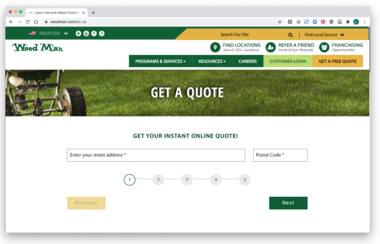
For example, while this form does provide wayfinding tools, it also uses placeholder attributes with no other indication of what information they seek in those fields.
An improved version of this form provides clear instructions for the user on how to use the form, as well as labels above each field. Red callouts allow the user to understand where they may gather certain pieces of information.

If you read through this and thought, “Gee, that sounds like the way I’d like my forms designed,” you’d be right. Accessible design is just good design. Making changes to forms is just one way we can easily expand and welcome our audiences to interact with our organizations and brands. It's a simple way to help them achieve their goals, and allow us to best serve their needs.
About the Reason One Accessibility Team (r1at)
R1at — fondly pronounced as "riot" — has been meeting weekly for many years to learn, share, and create better, more accessible websites. We’re pretty passionate about accessibility, and we’re available to answer your questions.